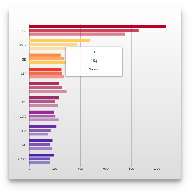
All Vizuly components come with their own unique customizable data tips as can be seen below in this Bar Chart example.
While all Vizuly data tips follow the same programming design pattern you can reference a given components API documentation for additional details on data tip implemention for that component. In this tutorial we will discuss the overall data tip design patterns and how you can customize data tips based on your own requirements.
viz.dataTipRenderer()
The main entry point into customzing a components data tip is through its dataTipRenderer function. Each component has its own default data tip renderer, an example of which can be found in that components specific documentation. The purpose of the dataTipRenderer is to process its incoming arguments and return an HTML string that will be used to create the data tip itself.
The dataTipRenderer is called by the components internal function component.showDataTip() when it wants to display a data tip, which can be triggered by component specific interaction events. When the the dataTipRenderer is called the following arguments are passed into the function:
| Parameter | Description |
|---|---|
tip |
a d3 selection of the parent data tip DIV element |
e |
The associated DOM element associated with the event triggering the data tip. |
d |
The datum associated with the data tip. |
i |
The index of the datum in its parent series. |
j |
The group index (optional) that the datum belongs to. |
x |
The suggested x position for the data tip (relative to the components parent DOM container.) |
y |
The suggested y position for the data tip (relative to the components parent DOM container.) |
Below is the default renderer for the Bar Chart.
function dataTipRenderer(tip, e, d, i, j, x, y) {
    var html = '<div class="vz-tip-header1">HEADER1</div>' +
     '<div class="vz-tip-header-rule"></div>' +
     '<div class="vz-tip-header2"> HEADER2 </div>' +
     '<div class="vz-tip-header-rule"></div>' +
     '<div class="vz-tip-header3" style="font-size:12px;"> HEADER3 </div>';

    var h1 = scope.y(d);
    var h2 = scope.labelFormat(scope.x(d));
    var h3 = scope.seriesLabel(d);

    html = html.replace("HEADER1", h1);
    html = html.replace("HEADER2", h2);
    html = html.replace("HEADER3", h3);

    tip.style('height', '80px').html(html);

    return [(Number(x) + Number(d3.select(e).attr('width'))), y - 50]
}
As you can see in the Bar Chart example above, we first create an HTML template string in the variable html. We then set 3 variables (h1, h2, h3) corresponding to certain properties of the d datum. In this case h1 holds the viz.y() value (d.country), h2 holds the label formatted value of viz.x() of the datum (d.value) and h3 is set to the viz.seriesLabel() which corresponds to the d.category property. We then use our template declared in the html variable and replace the place holder values with our h1, h2, and h3 values.
Finally we set the height of our data tip by calling the tip.style('height','80px') and the html via the tip.html(html) setter. The final return statement sends back the original x, and y parameters with some slight measurement modifications to place the data tip at the end and above the bar in question. Note, the tip parameter is a d3.selection that has many convienence routines associated with it for modification.
All Vizuly components follow the same general design pattern referenced above in the dataTipRenderer to create their data tips, but you are free to modify and position the tip parameter however you see fit. The important thing is to return the x and y coordinates of where you want the data tip placed on the screen.
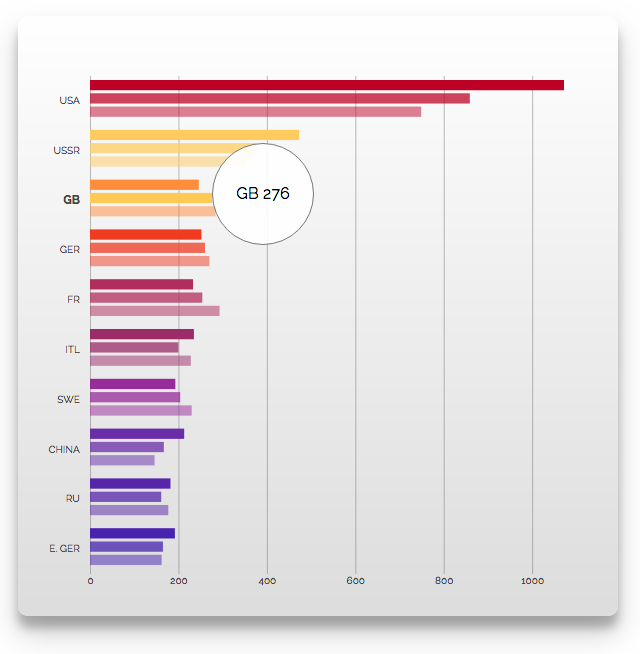
Custom Data Tips
Based on the Bar Chart example above, lets say we want to create a completely custom data tip that would look like the example below:
Our first step would be to create a custom data tip renderer function
function myDataTipRenderer(tip, e, d, i, j, x, y) {
    tip
     .style('width', '80px')
     .style('height', '80px')
     .style('border-radius', '80px')
     .style('text-align','center')
     .style('line-height','80px')
     .style('box-shadow','none')
     .style('border','1px solid #777')
     .html(d.country + ' ' + d.value)

    return [(Number(x) + Number(d3.select(e).attr('width'))), y - 50];
}
As you can see in this custom function we use the d3.style method of the tip parameter to alter some of its styles, creating a circular element with a solid colored border and centered text. We then pass in a very simple HTML string consisting of the d.country and d.value data values. Finally we use the same return of [x,y] coordinates as the default dataTipRenderer so our tip is placed at the end of each bar.
The final step in this code will be to tell the bar chart that we want to use this new function myDataTipRenderer.
viz.dataTipRenderer(myDataTipRenderer);
This is a relatively simple example of making a custom data tip, but as you can probably imagine, with a little creativity you can create very uniquely branded and styled data tips that could meet a myriad of specific design requirements.
Turning off Data Tips
In the situation where you want to turn off data tips completely you simply need to pass viz.dataTipRenderer a false or null value and this will prevent the component from displaying any data tips.
viz.dataTipRenderer(false);